Convolutional neural networks (or convnets) create task-relevant representations of the training images by learning filters, which isolate from an image some feature of interest. Trained to classify images of cars, for example, a convnet might learn to filter for certain body or tire shapes.
In this article we’ll look at a couple ways of visualizing the filters a convnet creates during training and what kinds of features these correspond to in the training data. The first method is to look at the feature maps or (activation maps) a filter produces, which show us roughly where in an image the filter detected some feature. The second way will be through optimization visuzalizations, where we create an image of a filter’s preferred feature type through gradient optimization.
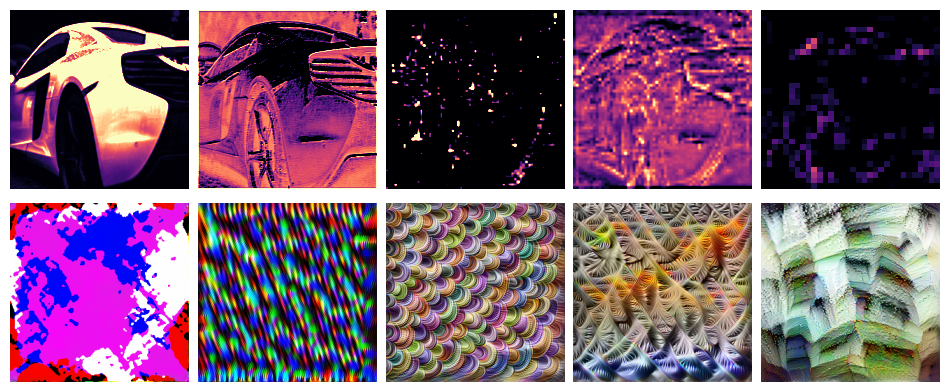
Feature maps (top) and feature-optimized images (below) from ResNet50V2. Layers become deeper from left to right.
Such visualizations illustrate the process of deep learning. Through deep stacks of convolutional layers, a convnet can learns to recognize a complex hierarchy of features. At each layer, features combine and recombine features from previous layers, becoming more complex and refined.
We’ll outline the two techniques here, but you can find the complete Python implementation on Github.
The Activation Model
Each filter in a convolutional layer generally produces an output of shape [height, width]. These outputs are stacked depthwise by the layer to produce [height, width, channel], one channel per filter. So a feature map is just one channel of a convolutional layer’s output. To look at feature maps, we’ll create an activation model, essentially by rerouting the output produced by a filter into a new model.
import tensorflow as tf
from tensorflow import keras
from tensorflow.keras.applications import VGG16


def make_activation_model(model, layer_name, filter):
    layer = model.get_layer(layer_name)  # Grab the layer
    feature_map = layer.output[:, :, :, filter]  # Get output for the given filter
    activation_model = keras.Model(
        inputs=model.inputs,  # New inputs are original inputs (images)
        outputs=feature_map,  # New outputs are the filter's outputs (feature maps)
    )
    return activation_model


def show_feature_map(image, model, layer_name, filter, ax=None):
    act = make_activation_model(model, layer_name, filter)
    feature_map = tf.squeeze(act(tf.expand_dims(image, axis=0)))
    if ax is None:
        fig, ax = plt.subplots()
    ax.imshow(
        feature_map, cmap="magma", vmin=0.0, vmax=1.0,
    )
    return ax


# Use like:
# show_feature_map(image, vgg16, "block4_conv1", filter=0)
Here is a sample of the first few feature maps from layers in VGG16:
What kind of feature will activate a given filter the most? We can find out by optimizing a random image through gradient ascent. We’ll use the filter’s activation model like before and train the image pixels just like we’d train the weights of a neural network.
Here’s a simple Keras-style implementation:
class OptVis:
    def __init__(
        self, model, layer, filter, size=[128, 128],
    ):
        # Activation model
        activations = model.get_layer(layer).output
        activations = activations[:, :, :, filter]
        self.activation_model = keras.Model(
            inputs=model.inputs, outputs=activations
        )
        # Random initialization image
        self.shape = [1, *size, 3]
        self.image = tf.random.uniform(shape=self.shape, dtype=tf.float32)

    def __call__(self):
        image = self.activation_model(self.image)
        return image

    def compile(self, optimizer):
        self.optimizer = optimizer

    @tf.function
    def train_step(self):
        # Compute loss
        with tf.GradientTape() as tape:
            image = self.image
            # We can include here various image parameterizations to
            # improve the optimization here. The complete code has:
            #
            # - Color decorrelation on Imagenet statistics
            # - Spatial decorrelation through a Fourier-space transform
            # - Random affine transforms: jitter, scale, rotate
            # - Gradient clipping
            #
            # These greatly improve the result
            #
            # The "loss" in this case is the mean activation produced
            # by the image
            loss = tf.math.reduce_mean(self.activation_model(image))
        # Apply *negative* gradient, because want *maximum* activation
        grads = tape.gradient(loss, self.image)
        self.optimizer.apply_gradients([(-grads, self.image)])
        return {"loss": loss}

    @tf.function
    def fit(self, epochs=1, log=False):
        for epoch in tf.range(epochs):
            loss = self.train_step()
            if log:
                print("Score: {}".format(loss["loss"]))
        image = self.image
        return to_valid_rgb(image)
Over on Kaggle, I wrote a couple of tutorials for working with TFRecords, a binary file format typically used for distributed training in TensorFlow. Of interest if you want to use TPUs for training neural networks.
Training a neural network is an optimization problem, the problem of minimizing its loss. The loss function\(Loss_X(w)\) of a neural network is the error of its predictions over a fixed dataset \(X\) as a function of the network’s weights or other parameters \(w\). The loss landscape is the graph of this function, a surface in some usually high-dimensional space. We can imagine the training of the network as a journey across this surface: Weight initialization drops us onto some random coordinates in the landscape, and then SGD guides us step-by-step along a path of parameter values towards a minimum. The success of our training depends on the shape of the landscape and also on our manner of stepping across it.
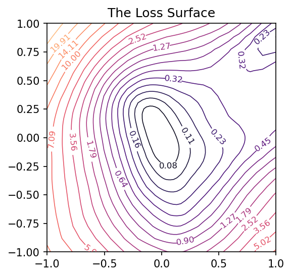
As a neural network typically has many parameters (hundreds or millions or more), this loss surface will live in a space too large to visualize. There are, however, some tricks we can use to get a good two-dimensional of it and so gain a valuable source of intuition. I learned about these from Visualizing the Loss Landscape of Neural Nets by Li, et al. (arXiv).
The Linear Case
Let’s start with the two-dimensional case to get an idea of what we’re looking for.
A single neuron with one input computes \(y = w x + b\) and so has only two parameters: a weight \(w\) for the input \(x\) and a bias \(b\). Having only two parameters means we can view every dimension of the loss surface with a simple contour plot, the bias along one axis and the single weight along the other:
Traversing the loss landscape of a linear model with SGD.
After training this simple linear model, we’ll have a pair of weights \(w^*\) and \(b^*\) that should be approximately where the minimal loss occurs – it’s nice to take this point as the center of the plot. By collecting the weights at every step of training, we can trace out the path taken by SGD across the loss surface towards the minimum.
Our goal now is to get similar kinds of images for networks with any number of parameters.
Making Random Slices
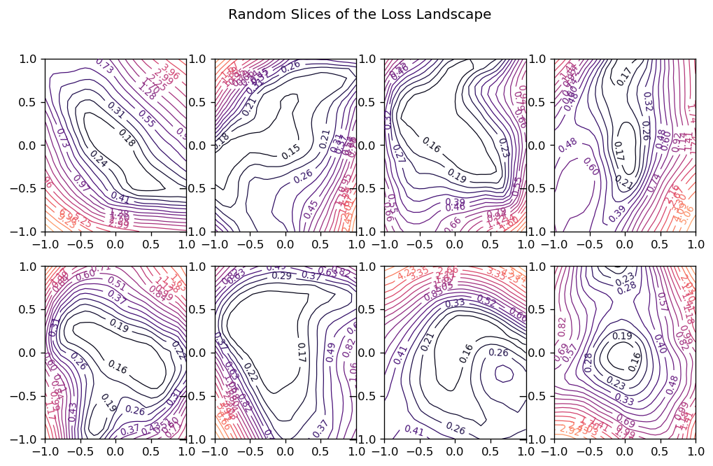
How can we view the loss landscape of a larger network? Though we can’t anything like a complete view of the loss surface, we can still get a view as long as we don’t especially care what view we get; that is, we’ll just take a random 2D slice out of the loss surface and look at the contours that slice, hoping that it’s more or less representative.
This slice is basically a coordinate system: we need a center (the origin) and a pair of direction vectors (axes). As before, let’s take the weights \(W^*\) from the trainined network to act as the center, and the direction vectors we’ll generate randomly.
Now the loss at some point \((a, b)\) on the graph is taken by setting the weights of the network to \(W^* + a W_0 + b W_1\) and evaluating it on the given data. Plot these losses across some range of values for \(a\) and \(b\), and we can produce our contour plot.
We might worry that the plot would be distorted if the random vectors we chose happened to be close together, even though we’ve plotted them as if they were at a right angle. It’s a nice fact about high-dimensional vector spaces, though, that any two random vectors you choose from them will usually be close to orthogonal.
Here’s how we could implement this:
import matplotlib.pyplot as plt
import numpy as np
import tensorflow as tf
from tensorflow import keras
from tensorflow.keras import callbacks, layers

class RandomCoordinates(object):
    def __init__(self, origin):
        self.origin_ = origin
        self.v0_ = normalize_weights(
            [np.random.normal(size=w.shape) for w in origin], origin
        )
        self.v1_ = normalize_weights(
            [np.random.normal(size=w.shape) for w in origin], origin
        )

    def __call__(self, a, b):
        return [
            a * w0 + b * w1 + wc
            for w0, w1, wc in zip(self.v0_, self.v1_, self.origin_)
        ]


def normalize_weights(weights, origin):
    return [
        w * np.linalg.norm(wc) / np.linalg.norm(w)
        for w, wc in zip(weights, origin)
    ]


class LossSurface(object):
    def __init__(self, model, inputs, outputs):
        self.model_ = model
        self.inputs_ = inputs
        self.outputs_ = outputs

    def compile(self, range, points, coords):
        a_grid = tf.linspace(-1.0, 1.0, num=points) ** 3 * range
        b_grid = tf.linspace(-1.0, 1.0, num=points) ** 3 * range
        loss_grid = np.empty([len(a_grid), len(b_grid)])
        for i, a in enumerate(a_grid):
            for j, b in enumerate(b_grid):
                self.model_.set_weights(coords(a, b))
                loss = self.model_.test_on_batch(
                    self.inputs_, self.outputs_, return_dict=True
                )["loss"]
                loss_grid[j, i] = loss
        self.model_.set_weights(coords.origin_)
        self.a_grid_ = a_grid
        self.b_grid_ = b_grid
        self.loss_grid_ = loss_grid

    def plot(self, range=1.0, points=24, levels=20, ax=None, **kwargs):
        xs = self.a_grid_
        ys = self.b_grid_
        zs = self.loss_grid_
        if ax is None:
            _, ax = plt.subplots(**kwargs)
            ax.set_title("The Loss Surface")
            ax.set_aspect("equal")
        # Set Levels
        min_loss = zs.min()
        max_loss = zs.max()
        levels = tf.exp(
            tf.linspace(
                tf.math.log(min_loss), tf.math.log(max_loss), num=levels
            )
        )
        # Create Contour Plot
        CS = ax.contour(
            xs,
            ys,
            zs,
            levels=levels,
            cmap="magma",
            linewidths=0.75,
            norm=mpl.colors.LogNorm(vmin=min_loss, vmax=max_loss * 2.0),
        )
        ax.clabel(CS, inline=True, fontsize=8, fmt="%1.2f")
        return ax
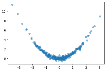
Let’s try it out. We’ll create a simple fully-connected network to fit a curve to this parabola:
# Create some data
NUM_EXAMPLES = 256
BATCH_SIZE = 64
x = tf.random.normal(shape=(NUM_EXAMPLES, 1))
err = tf.random.normal(shape=x.shape, stddev=0.25)
y = x ** 2 + err
y = tf.squeeze(y)
ds = (tf.data.Dataset
      .from_tensor_slices((x, y))
      .shuffle(NUM_EXAMPLES)
      .batch(BATCH_SIZE))
plt.plot(x, y, 'o', alpha=0.5);
# Fit a fully-connected network (ie, a multi-layer perceptron)
model = keras.Sequential([
  layers.Dense(64, activation='relu'),
  layers.Dense(64, activation='relu'),
  layers.Dense(64, activation='relu'),
  layers.Dense(1)
])
model.compile(
  loss='mse',
  optimizer='adam',
)
history = model.fit(
  ds,
  epochs=200,
  verbose=0,
)

# Look at fitted curve
grid = tf.linspace(-4, 4, 3000)
fig, ax = plt.subplots()
ax.plot(x, y, 'o', alpha=0.1)
ax.plot(grid, model.predict(grid).reshape(-1, 1), color='k')
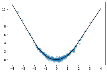
Looks like we got an okay fit, so now we’ll look at a random slice from the loss surface:
# Create loss surface
coords = RandomCoordinates(model.get_weights())
loss_surface = LossSurface(model, x, y)
loss_surface.compile(points=30, coords=coords)

# Look at loss surface
plt.figure(dpi=100)
loss_surface.plot()
Improving the View
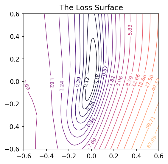
Getting a good plot of the path the parameters take during training requires one more trick. A path through a random slice of the landscape tends to show too little variation to get a good idea of how the training actually proceeded. A more representative view would show us the directions through which the parameters had the most variation. We want, in other words, the first two principal components of the collection of parameters assumed by the network during training.
from sklearn.decomposition import PCA

# Some utility functions to reshape network weights
def vectorize_weights_(weights):
    vec = [w.flatten() for w in weights]
    vec = np.hstack(vec)
    return vec


def vectorize_weight_list_(weight_list):
    vec_list = []
    for weights in weight_list:
        vec_list.append(vectorize_weights_(weights))
    weight_matrix = np.column_stack(vec_list)
    return weight_matrix


def shape_weight_matrix_like_(weight_matrix, example):
    weight_vecs = np.hsplit(weight_matrix, weight_matrix.shape[1])
    sizes = [v.size for v in example]
    shapes = [v.shape for v in example]
    weight_list = []
    for net_weights in weight_vecs:
        vs = np.split(net_weights, np.cumsum(sizes))[:-1]
        vs = [v.reshape(s) for v, s in zip(vs, shapes)]
        weight_list.append(vs)
    return weight_list


def get_path_components_(training_path, n_components=2):
    # Vectorize network weights
    weight_matrix = vectorize_weight_list_(training_path)
    # Create components
    pca = PCA(n_components=2, whiten=True)
    components = pca.fit_transform(weight_matrix)
    # Reshape to fit network
    example = training_path[0]
    weight_list = shape_weight_matrix_like_(components, example)
    return pca, weight_list


class PCACoordinates(object):
    def __init__(self, training_path):
        origin = training_path[-1]
        self.pca_, self.components = get_path_components_(training_path)
        self.set_origin(origin)

    def __call__(self, a, b):
        return [
            a * w0 + b * w1 + wc
            for w0, w1, wc in zip(self.v0_, self.v1_, self.origin_)
        ]

    def set_origin(self, origin, renorm=True):
        self.origin_ = origin
        if renorm:
            self.v0_ = normalize_weights(self.components[0], origin)
            self.v1_ = normalize_weights(self.components[1], origin)
Having defined these, we’ll train a model like before but this time with a simple callback that will collect the weights of the model while it trains:
# Create data
ds = (
    tf.data.Dataset.from_tensor_slices((inputs, outputs))
    .repeat()
    .shuffle(1000, seed=SEED)
    .batch(BATCH_SIZE)
)


# Define Model
model = keras.Sequential(
    [
        layers.Dense(64, activation="relu", input_shape=[1]),
        layers.Dense(64, activation="relu"),
        layers.Dense(64, activation="relu"),
        layers.Dense(1),
    ]
)

model.compile(
    optimizer="adam", loss="mse",
)

training_path = [model.get_weights()]
# Callback to collect weights as the model trains
collect_weights = callbacks.LambdaCallback(
    on_epoch_end=(
        lambda batch, logs: training_path.append(model.get_weights())
    )
)

history = model.fit(
    ds,
    steps_per_epoch=1,
    epochs=40,
    callbacks=[collect_weights],
    verbose=0,
)
And now we can get a view of the loss surface more representative of where the optimization actually occurs:
# Create loss surface
coords = PCACoordinates(training_path)
loss_surface = LossSurface(model, x, y)
loss_surface.compile(points=30, coords=coords, range=0.2)
# Look at loss surface
loss_surface.plot(dpi=150)
Plotting the Optimization Path
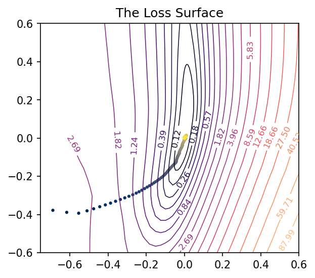
All we’re missing now is the path the neural network weights took during training in terms of the transformed coordinate system. Given the weights \(w\) for a neural network, in other words, we need to find the values of \(a\) and \(b\) that correspond to the direction vectors we found via PCA and the origin weights \(w_c\).
\[w - v_c = a v_0 + b v_1\]
We can’t solve this using an ordinary inverse (the matrix \( \left[\begin{matrix} v_0 & v_1 \end{matrix} \right] \) isn’t square), so instead we’ll use the Moore-Penrose pseudoinverse, which will give us a least-squares optimal projection of \(w\) onto the coordinate vectors:
This is the ordinary least squares solution to the equation above.
def weights_to_coordinates(coords, training_path):
    """Project the training path onto the first two principal components
using the pseudoinverse."""
    components = [coords.v0_, coords.v1_]
    comp_matrix = vectorize_weight_list_(components)
    # the pseudoinverse
    comp_matrix_i = np.linalg.pinv(comp_matrix)
    # the origin vector
    w_c = vectorize_weights_(training_path[-1])
    # center the weights on the training path and project onto components
    coord_path = np.array(
        [
            comp_matrix_i @ (vectorize_weights_(weights) - w_c)
            for weights in training_path
        ]
    )
    return coord_path


def plot_training_path(coords, training_path, ax=None, end=None, **kwargs):
    path = weights_to_coordinates(coords, training_path)
    if ax is None:
        fig, ax = plt.subplots(**kwargs)
    colors = range(path.shape[0])
    end = path.shape[0] if end is None else end
    norm = plt.Normalize(0, end)
    ax.scatter(
        path[:, 0], path[:, 1], s=4, c=colors, cmap="cividis", norm=norm,
    )
    return ax
Applying these to the training path we saved means we can plot them along with the loss landscape in the PCA coordinates:
Petals to the Metal is Kaggle’s newest Getting Started competition, highlighting Tensor Processing Units. A TPU is an accelerator developed by Google especially for machine learning. They can be used in TensorFlow much like GPUs, and are quite powerful. I had the pleasure of writing a tutorial to go along with the competition. Check it out!
Gaussian Discriminant Analysis (GDA) is the name for a family of classifiers that includes the well-known linear and quadratic classifiers. These classifiers use class-conditional normal distributions as the data model for their observed features:
\[(X \mid C = c) \sim Normal(\mu_c, \Sigma_c) \]
As we saw in the post on optimal decision boundaries, the classification problem is solved by maximizing the posterior probability of class \(C=c\) given the observed data \(X\). From Bayes’ theorem, the addition of class distributions to our model then determines the problem completely:
\[ p(C = c \mid X) = \frac{p(X \mid C = c)p(C=c)}{\Sigma_{c'} p(X \mid C = c')p(C=c')} \]
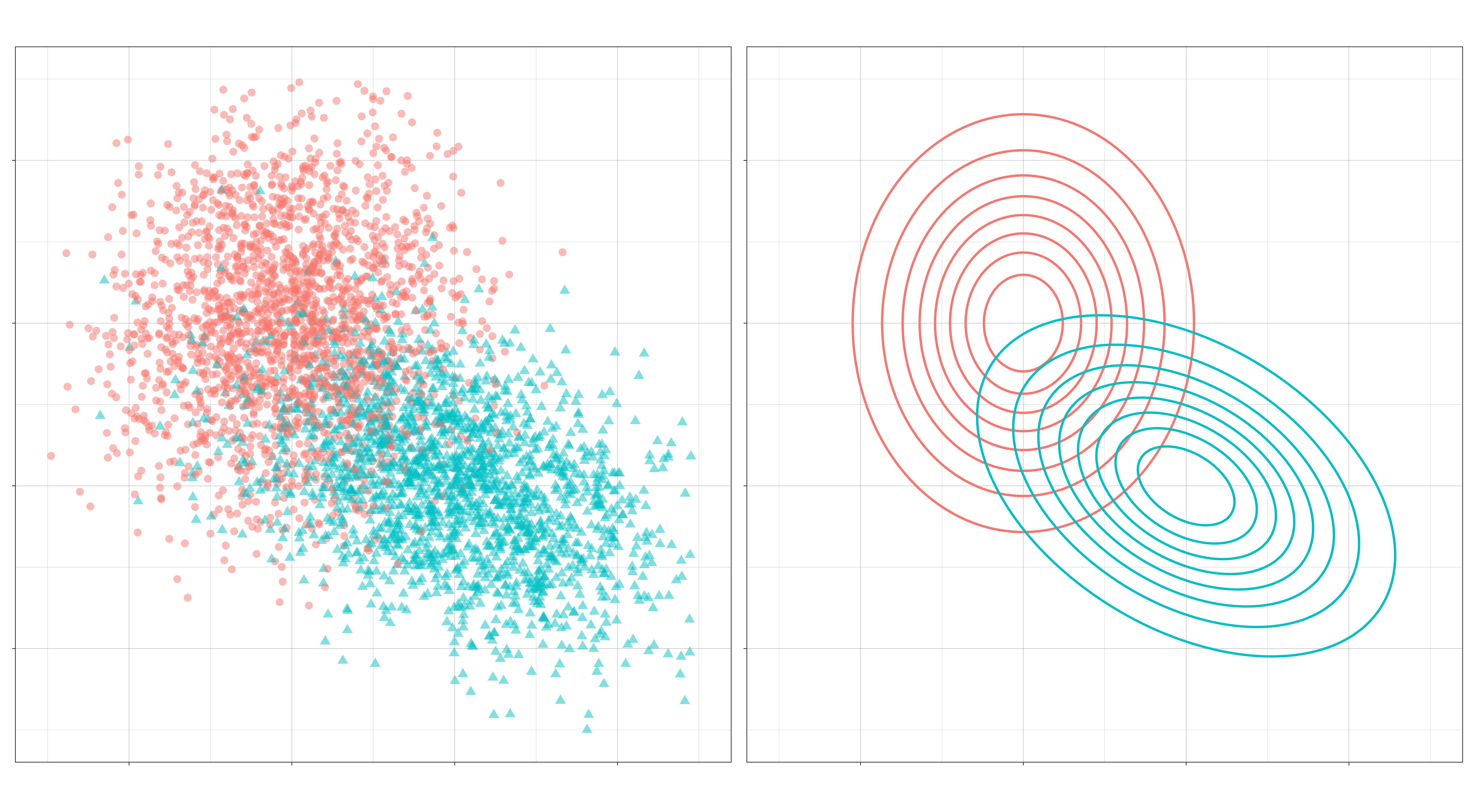
A typical set of class-conditional distributions for a binary classification problem might look like this:
Left: A sample from the feature distributions for the two-class case. Right: Their densities.
The classification problem then is to draw a boundary that optimally separates the two distributions.
Typically, this boundary is formed by comparing discriminant functions, obtained by plugging in normal densities into the Bayes’ formula above. For a given observation, these discriminant functions assign a score to each class; the class with the highest score is the class chosen for that observation.
In the most general case, the discriminant function looks like this:
where \(\pi_c = p(C = c)\) is the prior probability of class \(c\). The optimal decision boundary is formed where the contours of the class-conditional densities intersect – because this is where the classes’ discriminant functions are equal – and it is the covariance matricies \(\Sigma_k\) that determine the shape of these contours. And so, by making additional assumptions about how the covariance should be modeled, we can try to tune the performance of our classifier to the data of interest.
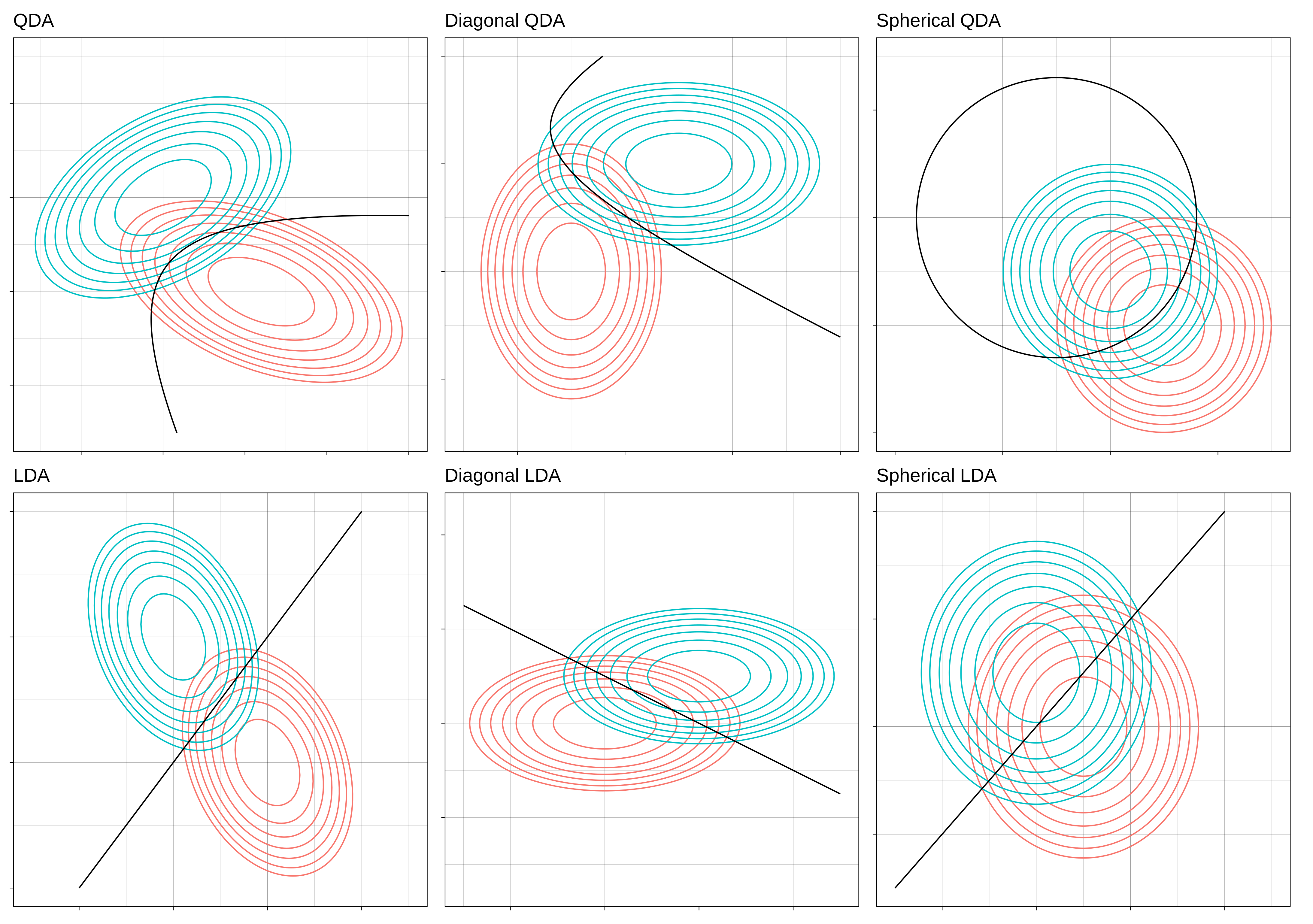
In this post, we’ll look at a few simple assumptions we can make about \(\Sigma_k\) and how that affects the kinds of decisions the classifier will arrive at. In particular, we’ll see that there are six kinds of models we can produce depending on three different assumptions.
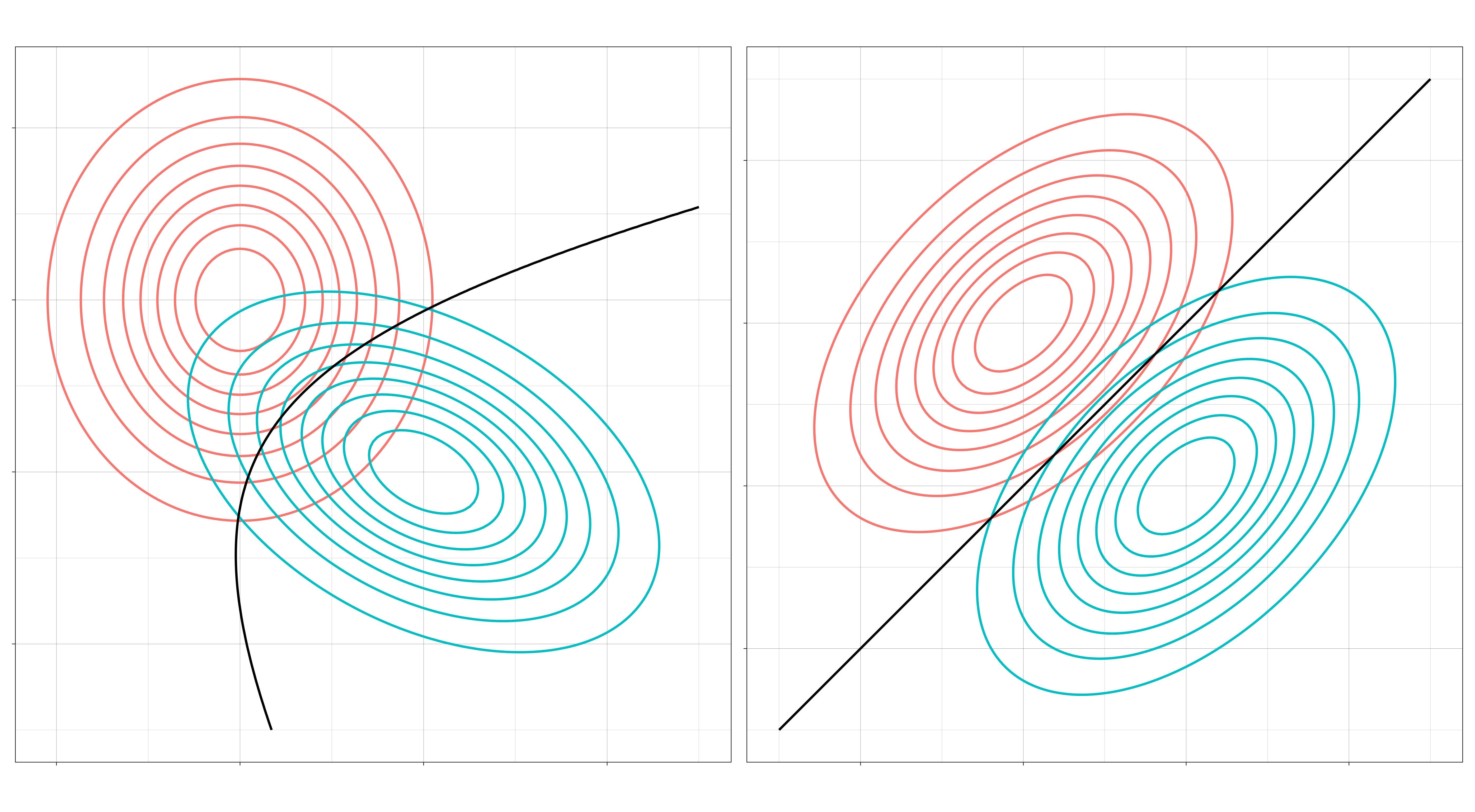
The decision boundaries of two GDA models. Left: Quadratic discriminant analysis. Right: Linear discriminant analysis.
Three Questions/Six Kinds
Let’s phrase these assumptions as questions. The first question regards the relationship between the covariance matricies of all the classes. The second and third are about the relationship of the features within a class.
I. Are all the covariance matrices modeled separately, or is there one that they share? If separate, then the decision boundaries will be quadratic. If shared, then the decision boundaries will be linear. (Separate means \(\Sigma_c \neq \Sigma_d\) when \(c \neq d\). Shared means \(\Sigma_c = \Sigma\) for all \(c\).)
Left: A quadratic decision boundary. Right: A linear decision boundary.
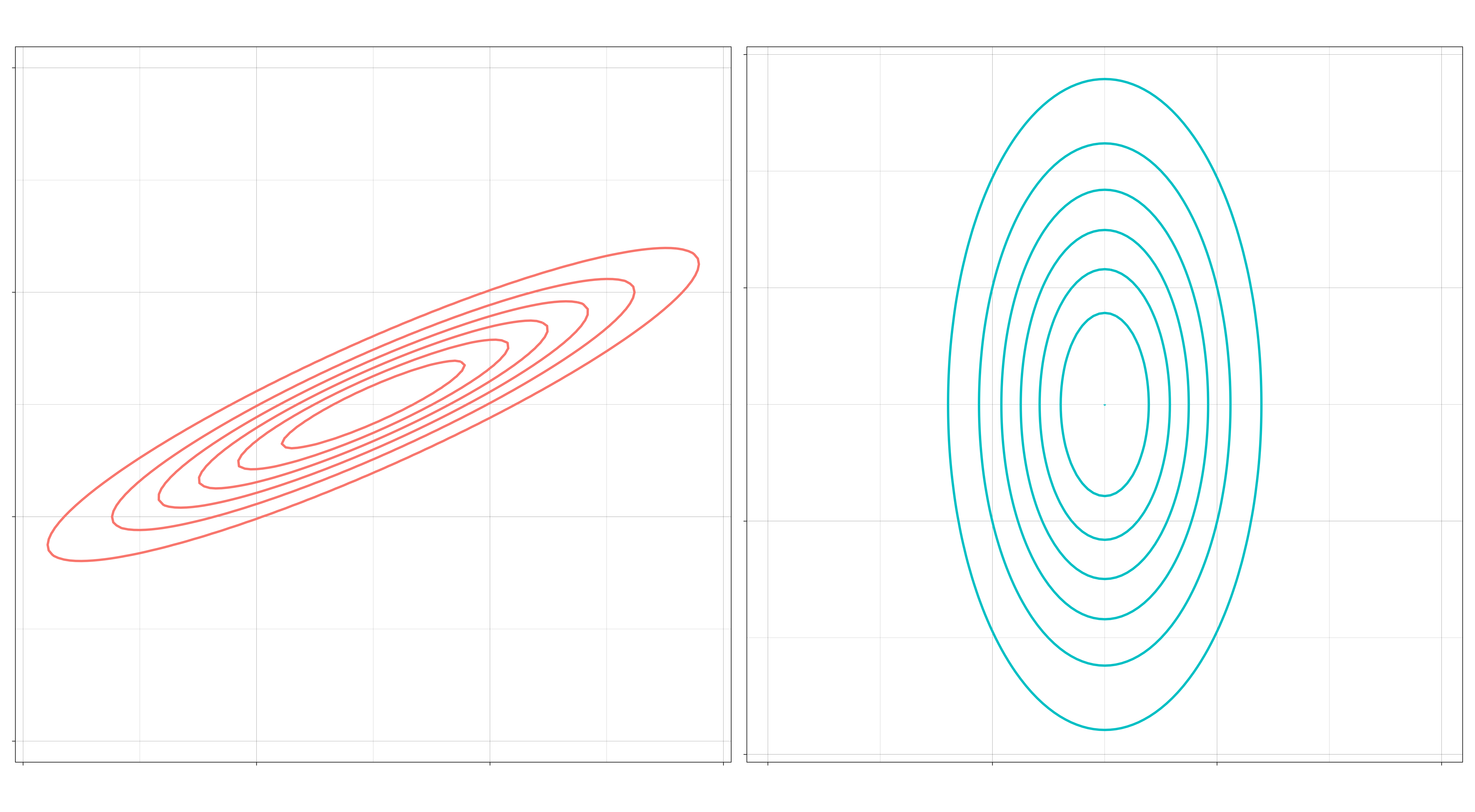
II. May the features within a class be correlated? If correlated, then the elliptical contours of the distribution will be at an angle. If independent, then they can only vary independently along each axis (up and down, left and right). (Independent means \(\Sigma_k\) is a diagonal matrix for all \(k\).)
Left: Distribution with correlated features. Right: Distribution with uncorrelated features.
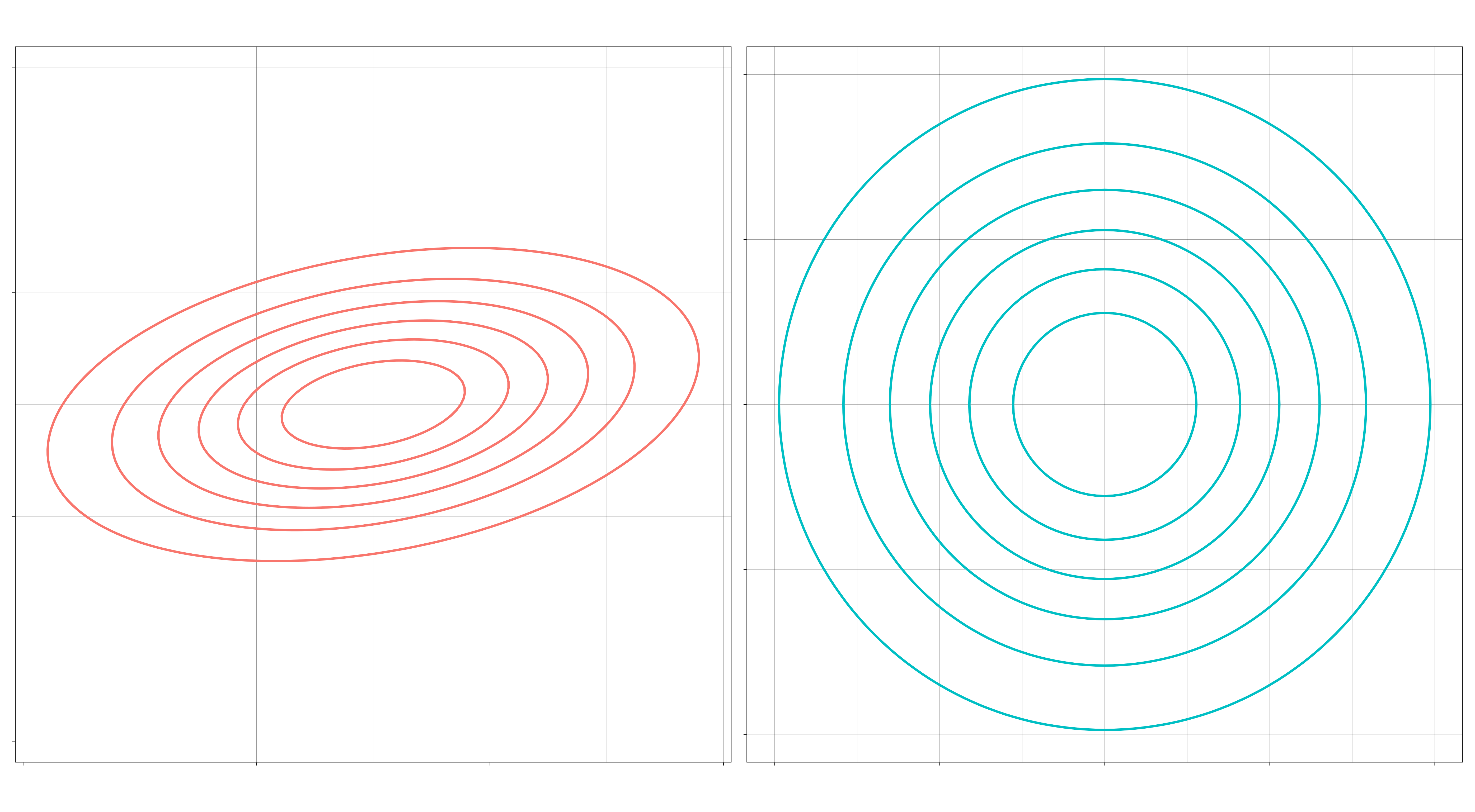
III. If the features within a class are uncorrelated, might they still differ by their standard deviations? If so, then the contours of the distribution can be elliptical. If not, then the contours will be spherical. (“No” means \(\Sigma_k = \sigma_k I\) for each \(k\), a multiple of the identity matrix.)
Left: An elliptical feature distribution. Right: Spherical feature distribution.
This gives us six different kinds of Gaussian disciminant analysis.
The more “no”s to these questions, the more restrictive the model is, and the more stable its decision boundary will be.
Whether this is good or bad depends on the data to which the model is applied. If there are a large number of observations relative to the number of features (a very long dataset), then the data can support a model with weaker assumptions. More flexible models require larger datasets in order to learn properties of the distributions that were not “built-in” by assumptions. The payoff is that there is less chance that the resulting model will differ a great deal from the true model.
But a model with the regularizing effect of strong assumptions might perform better when the number of observations is small relative to the number of features (a very wide dataset). Especially in high dimenions, the data may be so sparse that the classes are still well-separated by linear boundaries, even if the true boundaries are not linear. In very high-dimensional spaces (\(p > N\), there is not even enough data to obtain the MLE estimate, in which case some kind of regularization is necessary to even begin the problem.
So so that we know what kinds of assumptions we can make about \(\Sigma_k\), let’s take a look at how they affect the properties of the classifier.
Quadratic vs Linear
The most common distinction in discriminant classifiers is the distinction between those that have quadratic boundaries and those that have linear boundaries. As mentioned, the former go by quadratic discriminant analysis and the latter by linear discriminant analysis.
Recall the discriminant function for the general case:
Notice that this is a quadratic function: \(x\) occurs twice in the first term. We obtain the decision boundary between two classes \(c\) and \(d\) by setting equal their discriminant functions \( \delta_c(x) - \delta_d(x) = 0 \). The set of solutions to this equation is the decision boundary. Whenever the covariance matrices \(\Sigma_c\) and \(\Sigma_d\) are distinct, this will be a quadric equation forming a quadric surface. In two dimensions, these surfaces are the conic sections: parabolas, hyperbolas, and ellipses.
The optimal decision boundary generated by pairs of unequal covariance matrices.
Now let’s assume the covariance matrix \(\Sigma\) is the same for every class. After simplification of the equation \(\delta_c(x) - \delta_d(x) = 0\), there remains in this case only a single term depending on \(x\)
\[ x^\top \Sigma^{-1}(\mu_c - \mu_d) \]
which is linear in \(x\). This means the decision boundary is given by a linear equation, and the boundary is a hyperplane, which in two dimensions is a line.
The optimal decision bounary generated by two equal covariance matrices.
Correlated vs Uncorrelated
The first question (quadratic vs. linear) concerned the relationship between the features of each class and thus determined the shape of the boundaries that separate them. The next two questions are about the classes individually. These questions concern the shape of the distributions themselves.
The second question asks whether we model the features within a class as being correlated or not. Recall the form of a covariance matrix for two variables,
In this case, each feature can only vary individually along its own axis. Thinking about the covariance matrix as a linear transformation, this means that the distribution’s elliptical contours are obtained through a scaling transform applied to circles. In other words, the contours can vary through stretching and shrinking along an axis, but not through a rotation.
The optimal decision bounary generated by two diagonal covariance matrices.
The boundaries formed are quadratic because the two distributions have unequal covariances. If we kept the covariance matrices the same, all of the boundaries would remain linear.
When normally distributed variables are uncorrelated, they are also independent. This means that the diagonal models here are Naive Bayes classifiers.
Elliptical vs Spherical
The final question question concerns whether we put an additional constraint on diagonal covariance matricies, namely, whether we restrict the variances of the two features within a class to be equal. Calling this common variance \(\sigma^2\), such matrices look like
So, such matrices are simply scalar multiples of an identity matrix. The contours of the class-conditional distributions are spheres, and the decision boundaries themselves are also spherical.
The optimal decision boundary generated by two covariance matricies that are multiples of the identity.
Applied to standardized observations, a model of this sort would simply classify observations based upon their distance to the class means. In this way, Spherical LDA is equivalent to the nearest centroid classifier.
Model Mis-specification
The performance of a classifier will depend on how well its decision rule models the true data-generating distribution. The GDA family attempts to model the true distribution directly, and its performance will depend on how closely the true distribution resembles the chosen \(Normal(\mu_c, \Sigma_c)\).
What happens when the model diverges from the truth? Generally, the model will either not be flexible enough to fit the true decision boundary (inducing bias), or it will be overly flexible and will tend to overfit the data (inducing variance). In the first case, no amount of data will ever achieve the optimal error rate, while in the second case, the classifier does not use its data efficiently; in high dimensional domains, the amount of data needed to fit an under-specified model may be intractable.
To get a sense for these phenomena, let’s observe the behavior of a few of our GDA classifiers when we fit them on another distribution’s data model.
Example
In this example, the data was generated from a Diagonal QDA model. Show below are the LDA, Diagonal QDA, and QDA classifiers being fit to samples of increasing size.
Three discriminant classifiers being fit to data from a Diagonal QDA model. The optimal boundary is shown as a dashed line. Left: LDA. Center: Diagonal QDA. Right: QDA.
What we should notice is that the LDA model never achieves a good fit to the optimal boundary because it is constrained in a way inconsistent with the true model. On the other hand, the QDA model does achieve a good fit, but it requires more data to do so than the Diagonal QDA model. (Incidentally, I think the odd shape of the Diagonal QDA model in the center is an artifact of the way the {sparsediscrim} package constructs its decision rule. Apparently, it does so through some kind of linear sum. In any case, it seems quite efficient.)